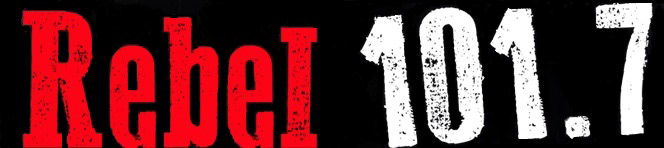
Original Rebel 101.7 Logo design circa 2010
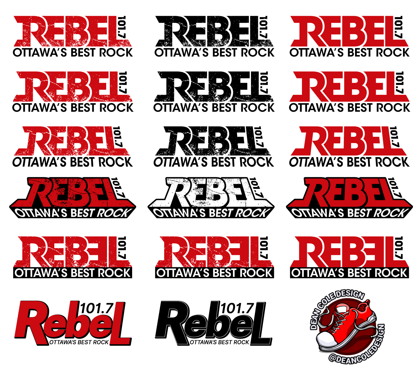
The first drafts for conceptualizing the old logo into something new. This included changing angles, adding shapes, backgrounds, distressed texture, and overall style.
I didn't want to stay too much on brand, so I also decided to create some more stylized versions of the logo in contrast to the original versions.
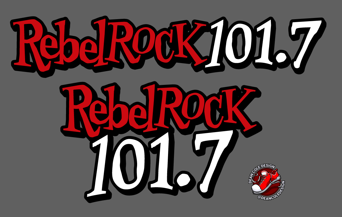
Around this point is when I was informed that "Rebel Rock 101.7" would be used as the new station name, so adjustments were made to fit everything in place.

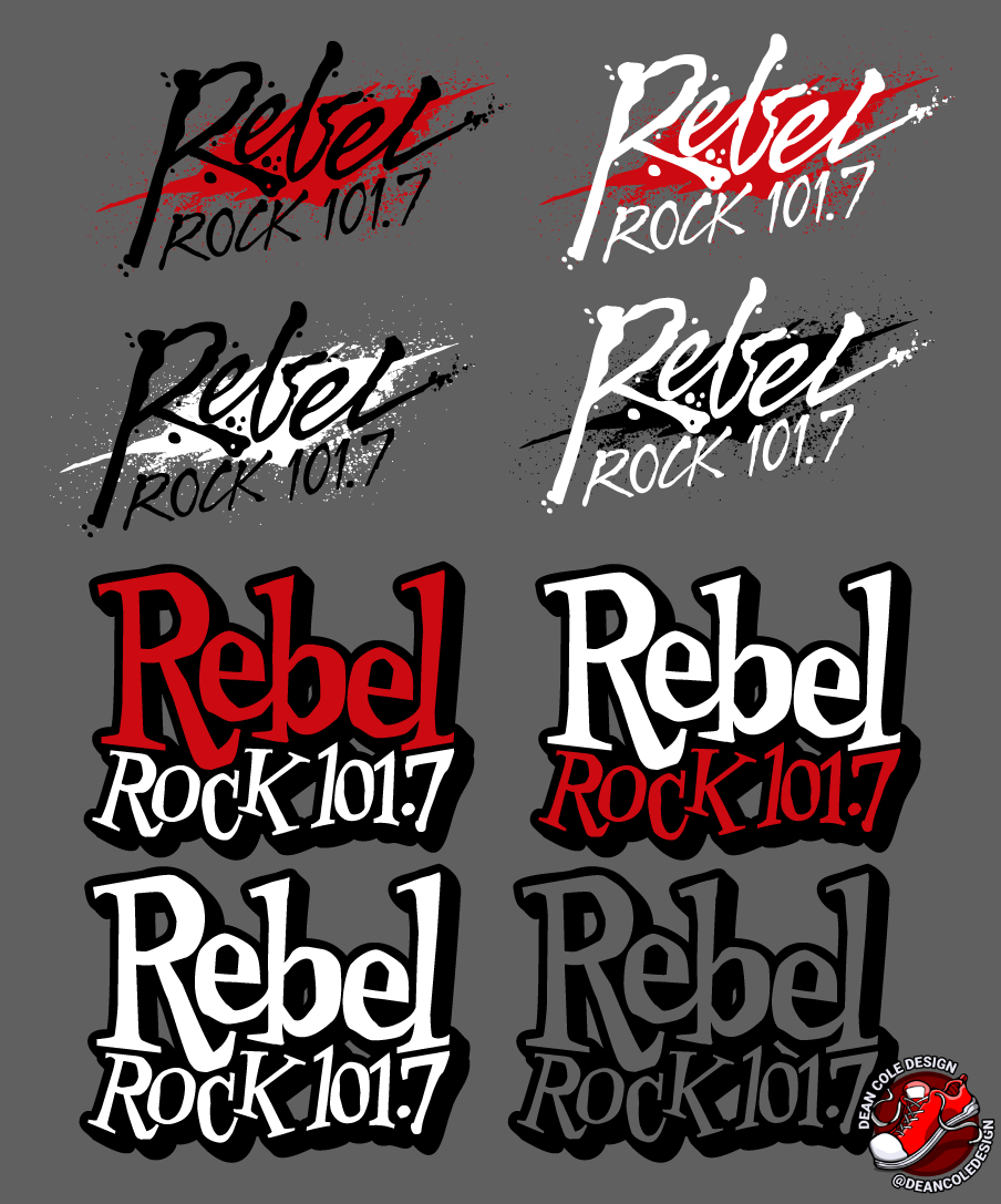
Further into the process, things deviated back to a more structured text logo.
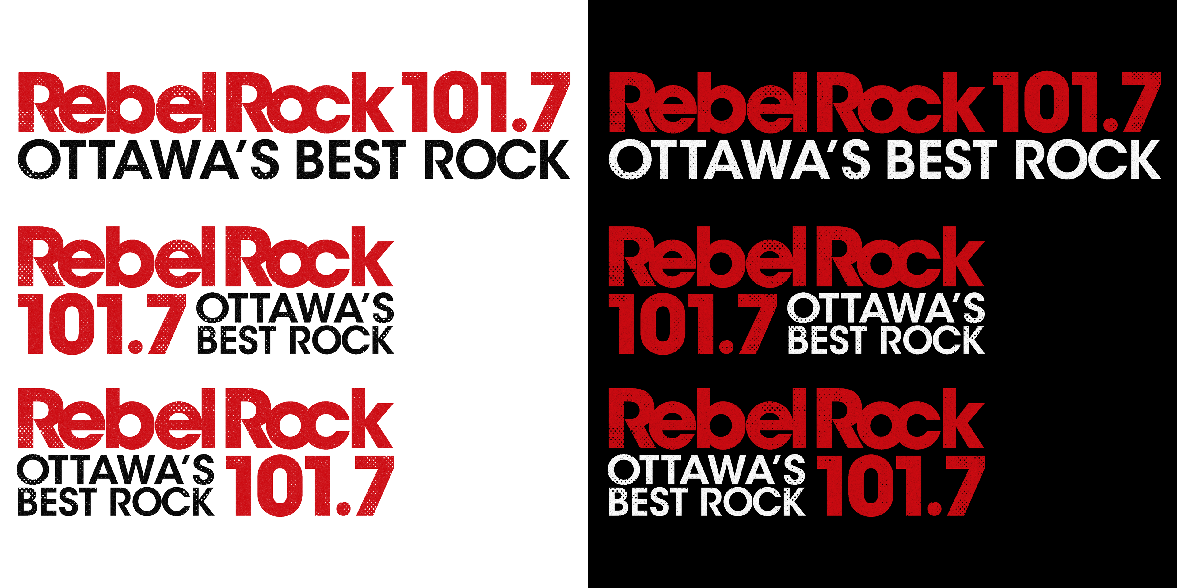
Some more updates to the logo that included removing the backdrop, and adding a distressed effect to the text. In this case, I used an abstract halftone with particulate splatter to create a "worn jersey" effect.

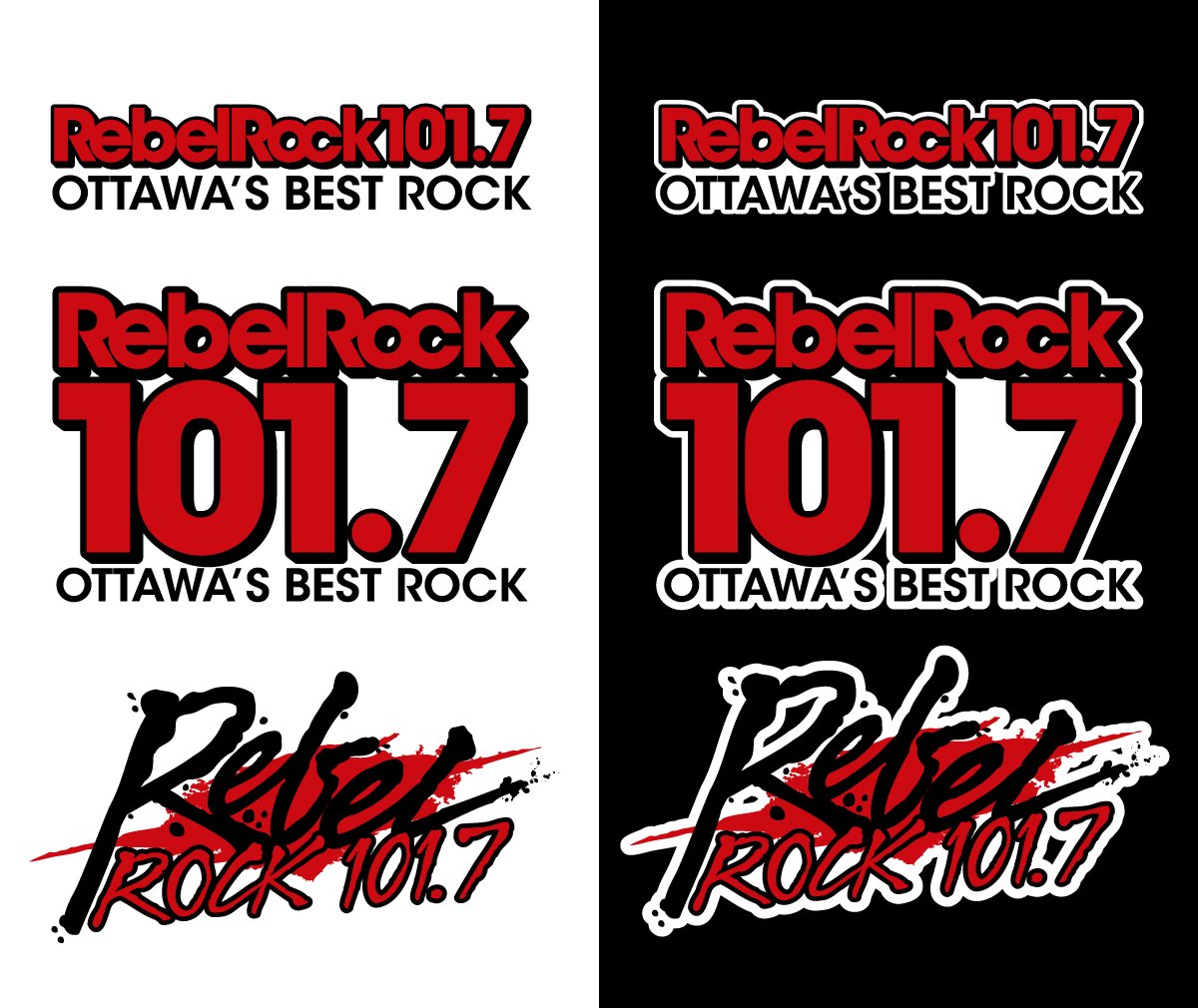
Alternate Logo - Red and Black
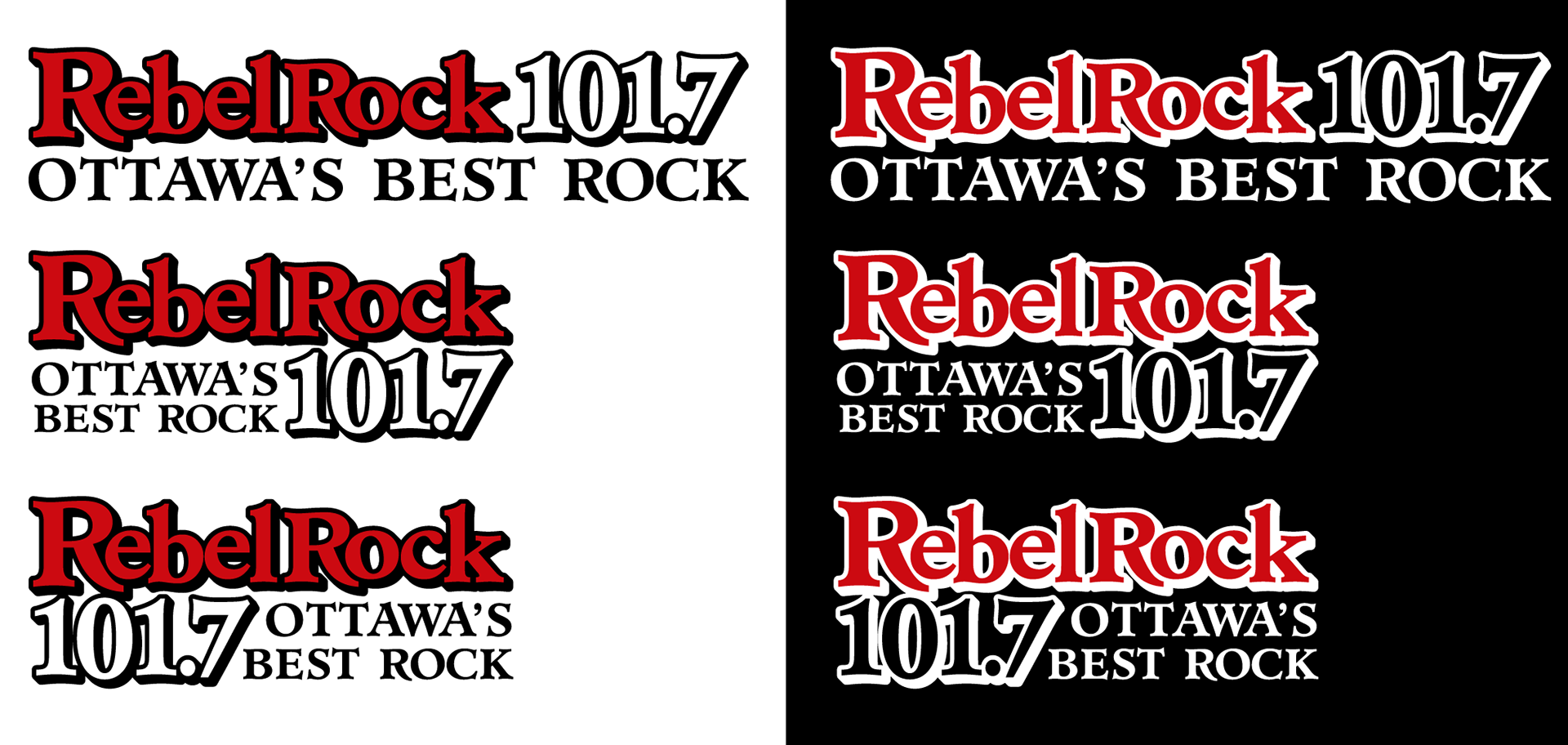
Alternate Logo - Red White Black
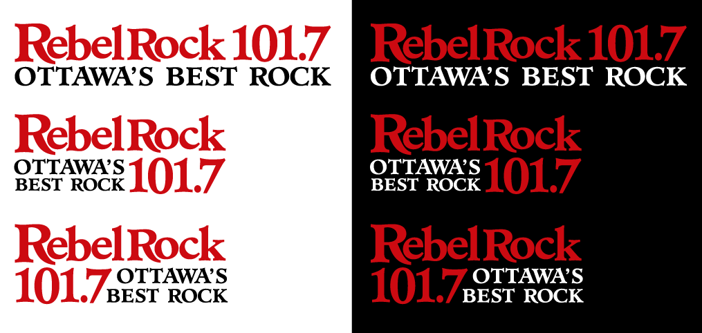
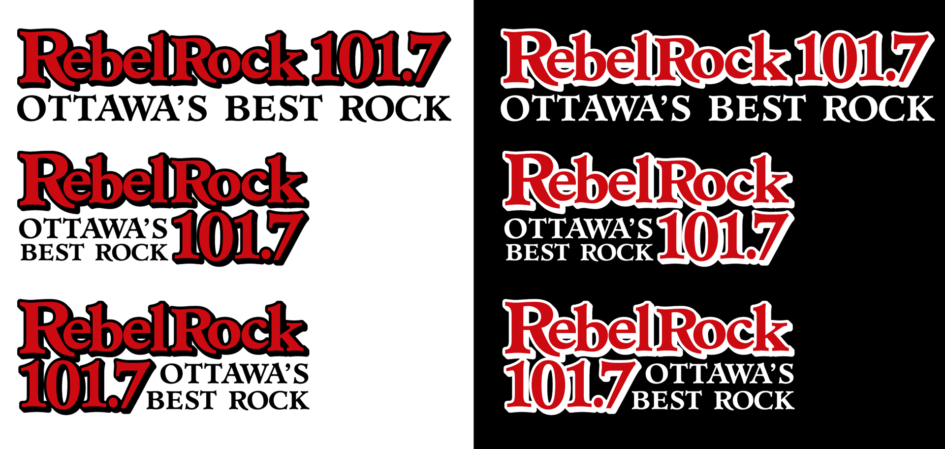
Alternate Logo - Flat Red and Black

Getting a little closer to the final logo, just needed something... tilty.
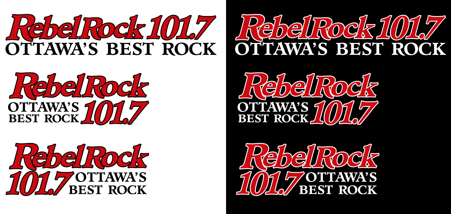
That's better. Ultimately, the final logo needed to be italicized.
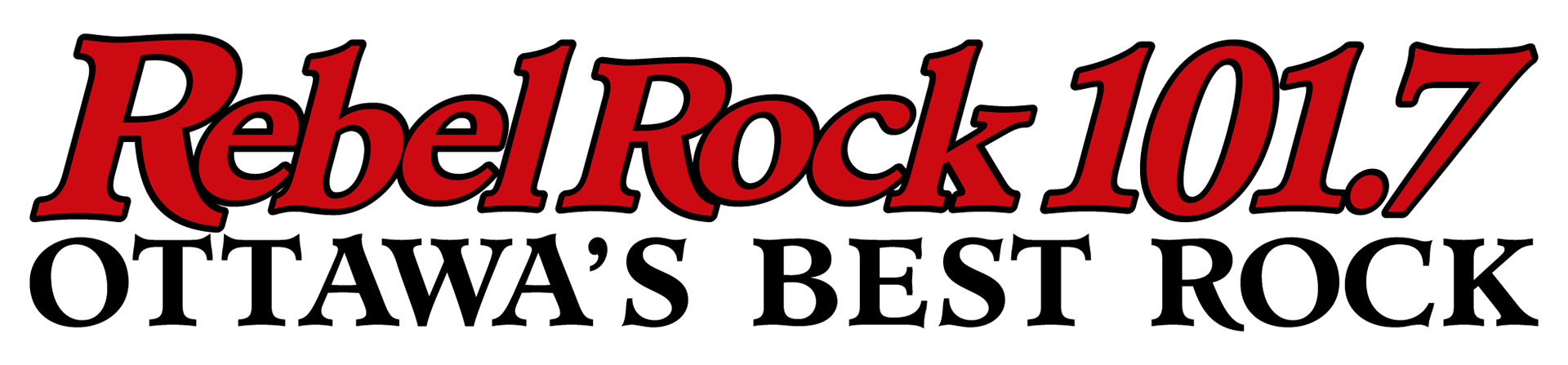
That's how we got from the original logo, to here.