My very first job coming out of college was User Interface Design with Industrial Design company, Design Interpretive. I was working with DI for 2.5 years on this project, and it was probably one of the best experiences learning User Interface and User Experience.
I was responsible for creating icons.... hundreds upon hundreds of icons. Somewhere along the lines of 400+, but one of the biggest changes I had made for the software was the look and feel. I had helped create a working system of modules and themes that could have colours changed at the switch of a setting.
The images following are NOT of the actual software, but are of the testing software I was given to make sure the icons looked correct and changed with the themes. The testing software itself shared some of the same features as the end product.
The Vesta 9-1-1 ECS is currently being used to dispatch emergency services around the world and has changed ownership to Motorola Solutions.
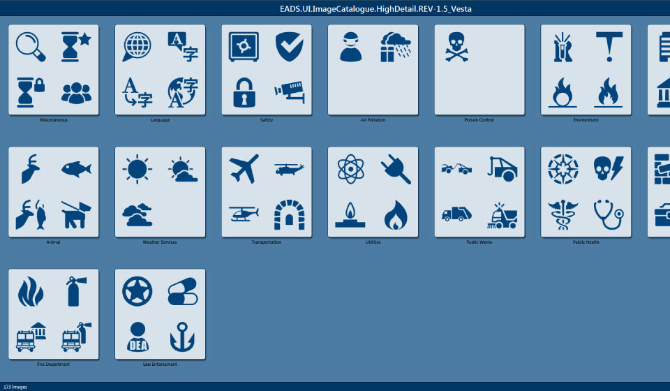
These are some of the icons on the default "Cassidian Blue" theme.
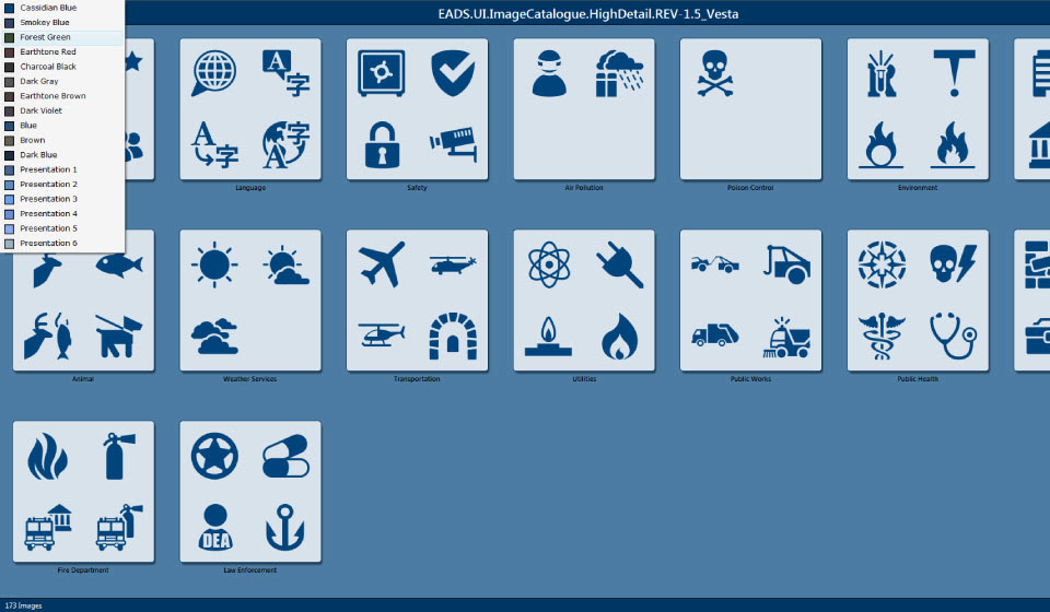
Clicking in the menu helped you choose some of the many colours used in the software. Selecting "Forrest Green"
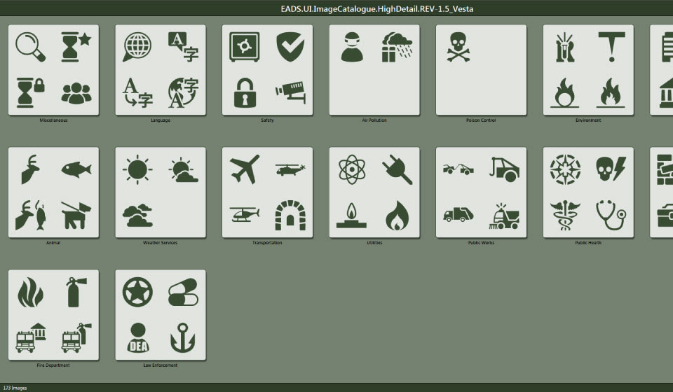
In the theme change, Icons take the darkest colour and if used on buttons, will change to a white on dark.
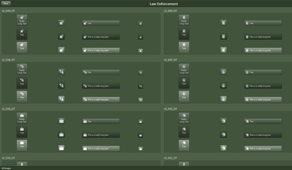
This is the button layout screen, where you could test the size of the icon on the smallest and largest buttons with and without the proper text identifier. This aided in the visibility of the icons on the software.
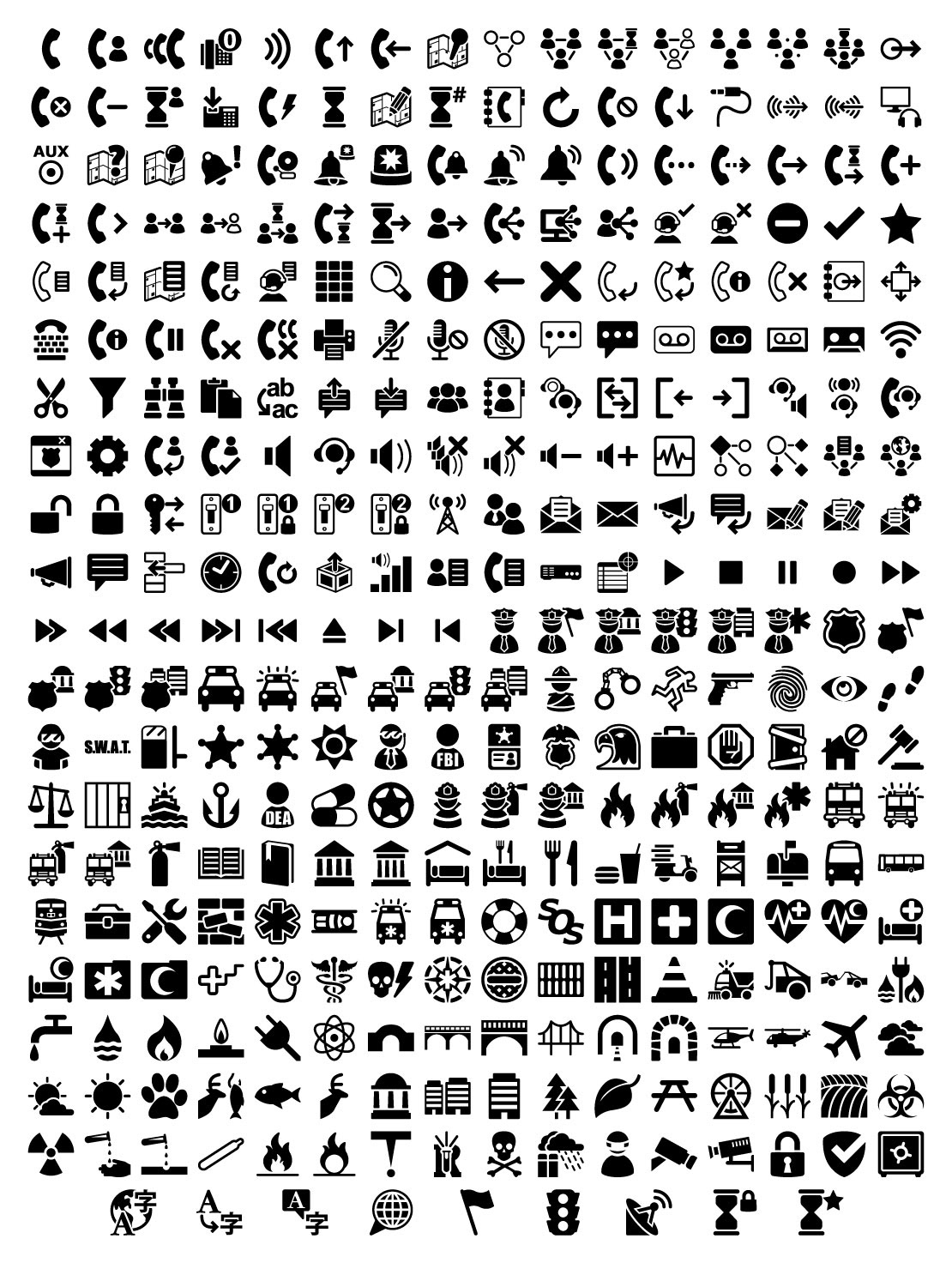
This is a very small selection of the icons I had to produce for the collection. All of the icons had to convey a message and then that message became slightly altered with the use of a Modifier Icon. There were spots for up to two modifiers, and we had to have weekly meetings in order to confirm whether or not they fit the idea of what that icon was meant to represent. All icons can be customized and assigned to the user preferences.